There isn’t a social media platform dedicated to sharing food photos and recipes and that is what Nosh is trying to solve. Nosh is all about improving the food sharing experience.
To create a space where foodies can share their food photos and recipes, and also get inspiration from other app users.
I fleshed out a UX research plan, which included a competitive analysis and a survey with usability testing.
I conducted a competitive analysis to familiarize myself with the social media industry and processes. I identified multiple ways in which these competitors provide a better user experience:
I had 7 participants with varying social media habits fill out my survey. Some of the questions asked were:
Research Insights:
To see the complete survey results, click here to view it in a new window.
Using FigJam, I created a task flow for the user’s action to sign up/in and interact with other users’ posts on the app. As a result, this served as an outline for the required screens for the wireframes.
I created some sketches and low-fidelity wireframes to generate as many unique ideas as possible. I used this opportunity to visualize and decide the most efficient user flows.
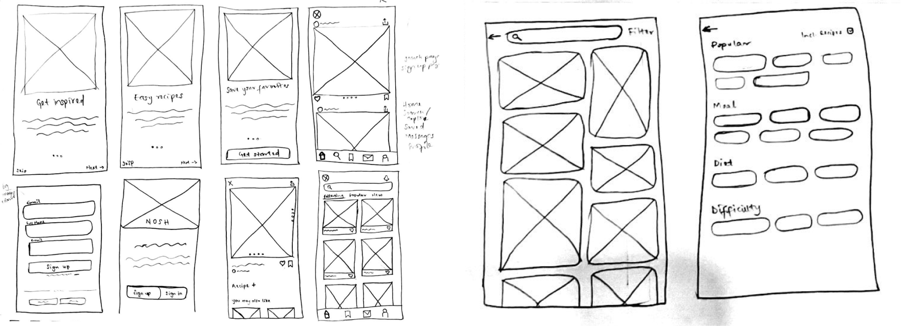
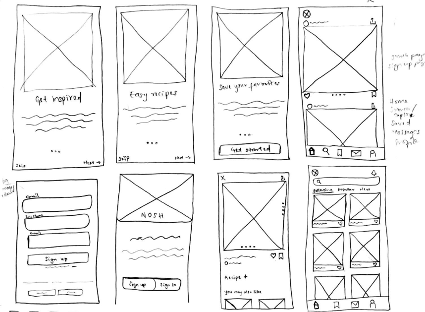
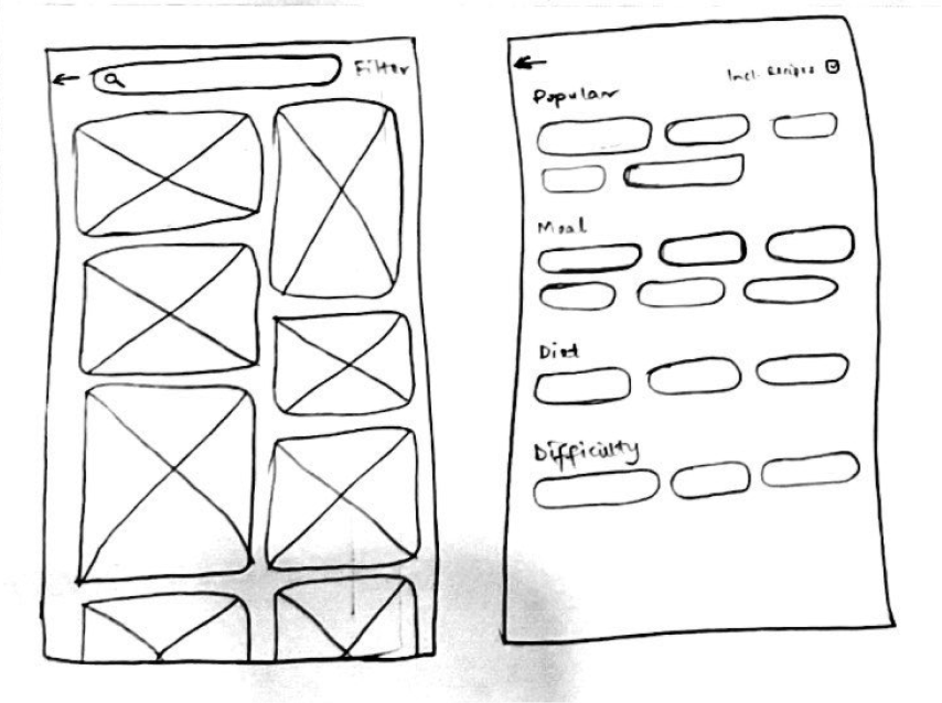
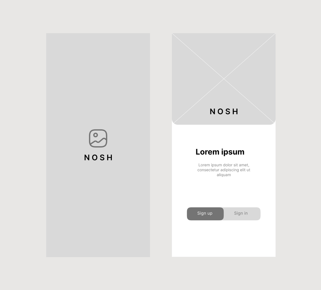
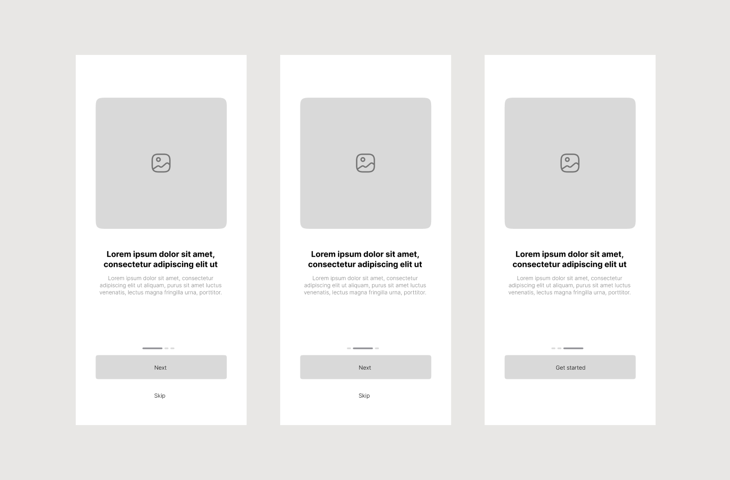
From the sketches I made, I came up with these low-fidelity wireframes, which helped me to visualize the overall flow and feel of the app.
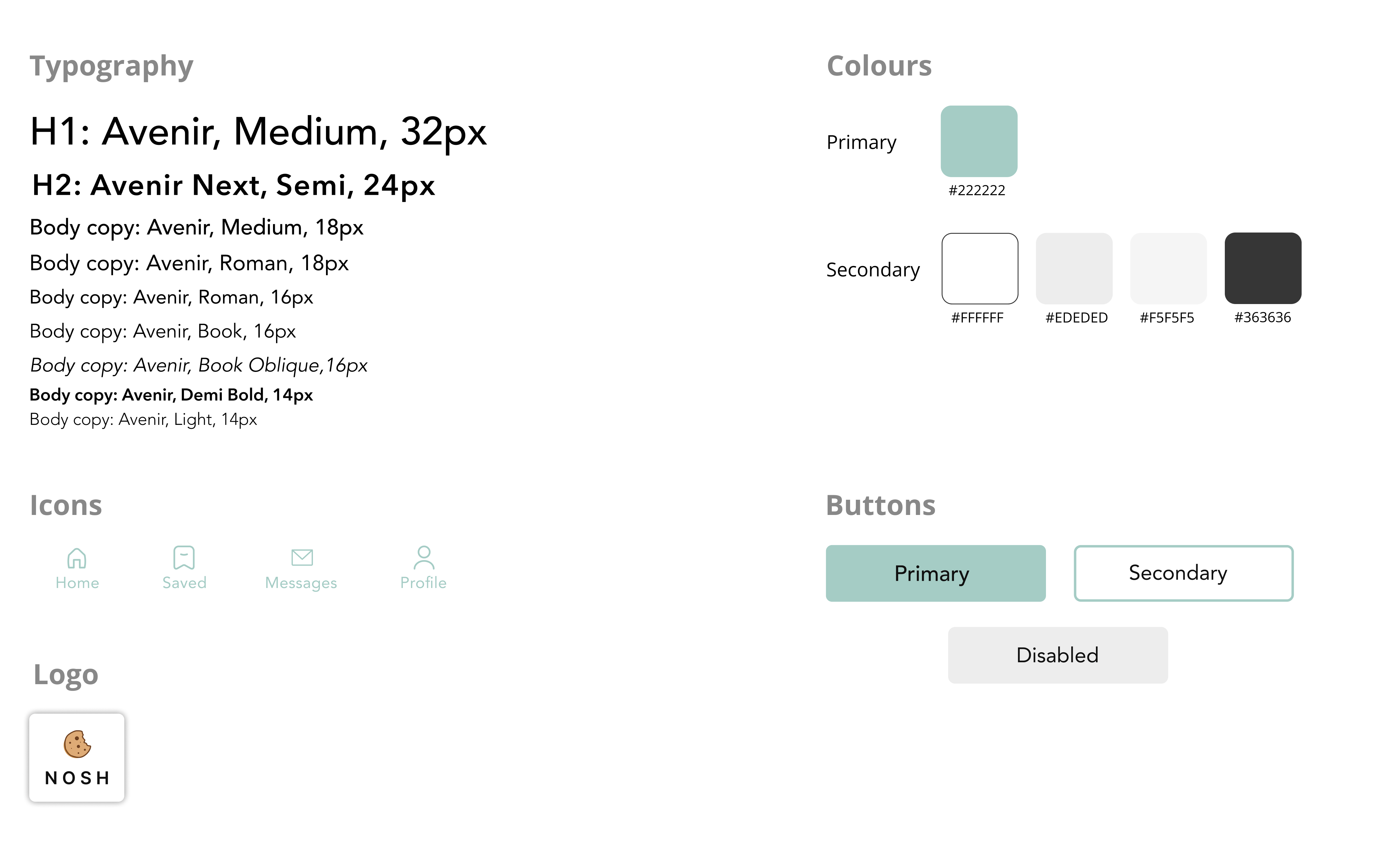
The goal of the Nosh brand was to showcase an approachable, fun and intuituve user experience. I explored various colours and typefaces that would best fulfill that goal.
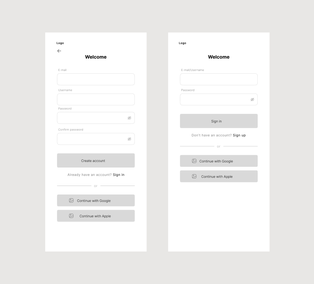
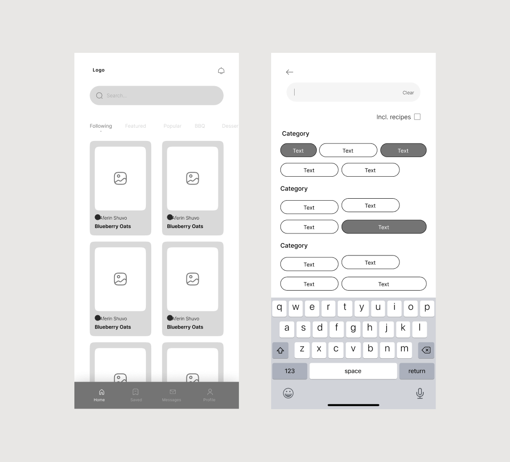
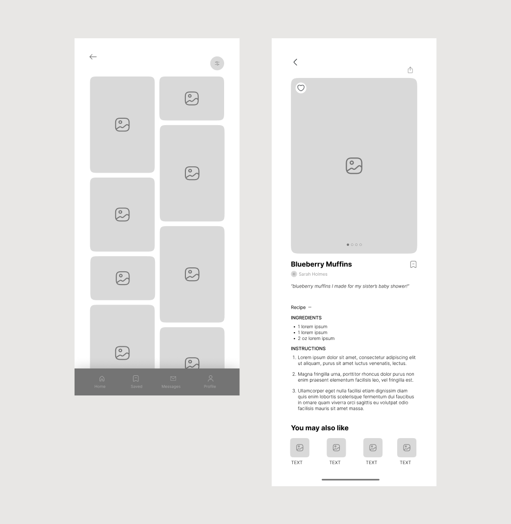
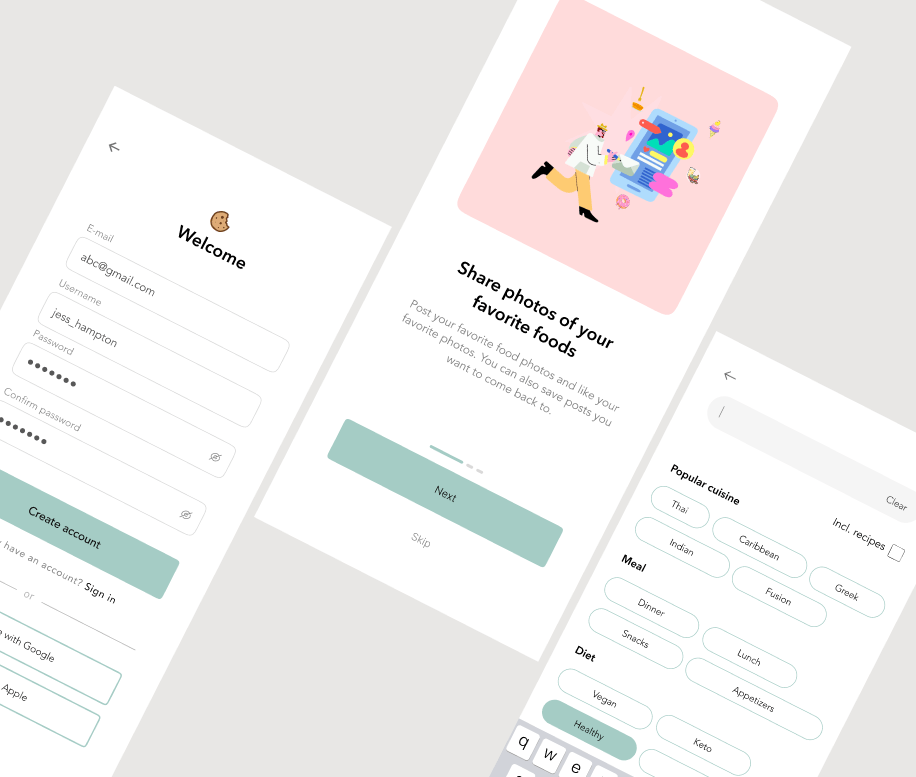
These are the high-fidelity designs I came up with. They show the flow of creatinng an account/signing in and interacting with posts on the app.
To see more, try out the prototype of the app below.
My objective was to test the sign-up/in flow, search, like and save features, as well as the overall navigation of the app. I did the testing using the high-fidelity prototype of the app that was developed in Figma using the mobile app designs.
I had 3 participants take part in this usability testing and these interviews were conducted virtually.
The participants completed the main flow of signing up and interacting with posts on the app by liking pictures/posts and saving them for later.
I love how this app looks! It looks so real.
This app is clean and I could see myself using it.
The app is very intuitive.
You can view and click-through the interactive prototype below.
Pro-tip: View it in full-screen to get the best experience!
The goal of the Nosh app was to provide a platform where users can network with another by sharing food posts and recipes. I learned that user research and testing are very important in the design process. By listening to my users’ feedback, I uncovered valuable insights that helped me improve my designs immensely and think outside the box.
The design process is highly iterative and there’s always an opportunity to improve my designs. The next step would be to design more screens to showcase even more user flows.